Tuesday, July 25, 2017

WHY THIS PROFESSIONAL PHOTOGRAPHER DOESN’T USE “ALL IN ONE” ZOOMS

I learned over 40 years ago talking to established professional photographers about where I should invest my money in photography equipment and every one of them said: “Put your money in your lenses.” You can save money in other gear like your tripod, camera bags, even your camera bodies, but not on lenses!

That’s why I’m not favorably impressed upon the announcement that Tamron has released an ultra tele-zoom with the widest zoom range yet—18-400mm; f3.5-6.3 for $649.00  This new lens, like its predecessors offering 18-200mm and 18-300mm, is still saddled with the same f3.5-6.3 variable apertures that makes all of these “all-in-one” zooms useless for professional portrait work. 

Aperture control: 

Why is that you ask?  Well, for the amateur photographers reading this that don’t know how one of these “all-in-one” zooms function, here’s the problem with these things: the variable aperture zoom lens only gives you its widest aperture f3.5 at 18mm and as soon as you start zooming it starts reducing the maximum aperture until you reach its maximum telephoto (200, 300, or 400mm) where the widest aperture is a paltry f6.3. What’s wrong with f6.3 you ask?  Well, if you are ONLY photographing group portraits, absolutely nothing. If I’m photographing an individual’s portrait I, like most professionals, want my aperture at f2.8 to f4.5 when my lens is zoomed in say at 200mm or 300mm.  That’s how professionals create portraits with separation between the background and the subject, while giving the background a nice painterly defused glow and/or Bokeh effect to the specular highlights.
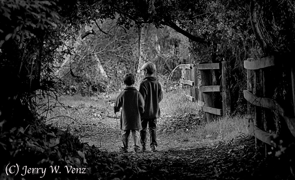
Like this:

f2.8 @ 1/250 sec., ISO 800; Lens @ 200mm
The worst thing about the variable aperture lens is that you, the photographer, have fewer choices in what you can pick for an aperture at a given focal length; the damn lens is telling you what you’re getting!  The f-stop is too important a decision, in professional photography, to be left up to a compromised lens design.

Auto Focus:

Another downside created by the relatively small maximum apertures of these “all-in-ones” is how they work (or don’t work) with your camera’s auto-focus system.  Many camera’s auto-focus systems require apertures of f5.6 or wider to function properly.  They need LIGHT to detect the contrast in a scene to lock focus quickly and accurately. That is another thing that we as professionals cannot compromise on! We rely on our auto-focus completely (don’t even try to manually focus a modern lens!) to “get the shot”. If our auto-focus does not work our yield goes down and that translates into a loss of income! If you do any action or sports photography the temptation in buying an “all-in-one” that teases you with 200, 300 or 400mm capability (especially at $649.00) is easily dashed when you discover that these lenses autofocus worse (or not at all!) at the best focal lengths ( 200, 300, and 400mm) for sports!

Sharpness, Chromatic Aberrations:

Yes, there’s more that these lenses are plagued with… Again, if you intend to use these lenses at their long focal lengths, guess what?  That’s exactly where they are the Least sharp! Where are they the sharpest?  At their Wide focal lengths—great….

Next, to quote dpreview.com, “A generous helping of chromatic aberration is to be expected with a SuperZoom.” This lens flaw is color shifting towards the edges when at wide-angle.  It can also happen in the telephoto ranges as well.

Finally, Distortion

All lenses distort and you as a photographer have the ability to lessen how much by watching your camera to subject distance and by using longer focal lengths when possible. However, these “all-in-ones” can have plenty of barrel distortion at wide and strong pincushion distortion at longer focal lengths. 

So, it just may be that spending $649.00 on a lens that can sabotage your image quality is spending too much! Spending twice as much—or more—on a lens that can do what YOU want it to do can be a wise, creative, investment.

Here’s my favorite lens…

The Canon 70-200 f2.8 Lens
The Canon 70-200 f2.8 lens is simply the Best lens I’ve ever owned in over 40 years in photography. It has paid for itself many times over in portrait sales, International PPA Competitions, and rock solid reliability because of its beautiful build quality.

’Til next week….

Author:  Jerry W. Venz.  PPA Master Photographer, Craftsman
Training site:  http://www.LightAtTheEdge.com
Client site: http://www.TheStorytellersUsa.com

Tuesday, July 18, 2017

ONE PROFESSIONAL’S FAVORITE BLACK & WHITE CONVERSION

I usually plan my portrait sessions around Color. Based on how many people and if there are children I will suggest one of my locations that has the best colors in its background for that particular month. Then I will suggest clothing colors that will go with the season and the colors in said background. 

Since this session was of just our client’s two boys and I wanted them to stand out against the background I suggested the boys be in red shirts. This location is not the usual park like setting you find in the city—it’s a more rustic location with a hiking trail along side a small stream with lots of trees and wild unkept ground cover. So, it was fitting to have the boys in the stand-out red we photographers like with our people out in rustic nature—it must be my Kodak foundation from my Kodachrome film days!

As is our usual practice we started with our bread and butter portraits of the boys together and individually, smiling, looking at the camera, in different poses, in different locations. Then I got to set-up this storytelling image…
 f5.0 @ 1/200 sec., ISO 800; lens @ 105mm
What I’m going for in this converted image is big brother leading his little brother into the ight—out of the dark scary forrest. 

Here’s the original color version…
Color Version
The color version just did not imply any menace to the children—it’s too colorful and there’s too much light in the foreground.

But, first the image needed to be cleaned-up a bit so I had my wife, kathi (my personal Photoshop Diva!) remove the three trail marker posts in front of the boys. That done we tried just burning in the foreground, making it a dark vignette, but I felt it was still too normal—I wanted creepy!

So, I gave up on color and dropped the image into my favorite B&W software; Nik, Silver Efex, Pro2 (Really upset that Google is no longer supporting this product…but that is a whole other issue.) I like many of Nik’s presets and its versions of Sepia and Brown Tones, but one of my favorite features of Silver Efex is it’s “film types” drop down menu—these are B&W film type emulators that are grouped by ISO.  Within its 18 different film types are many of my old B&W film favorites.

For this particular conversion I choose the Agfa APX 400 film type. Finally, the creepy  mood I was after!

Then to get rid of some foreground that wasn’t helping and make the boys a little larger within the frame I cropped in, mostly top and bottom, making the image a longer landscape.

I still plan my sessions around color because that’s what most clients want and it pays the bills!

Let me know if you have any question….’Til next week…

Author:  Jerry W. Venz, PPA Master Photography, Craftsman
Training Site:  http://www.LightAtTheEdge.com
Client site: http://www.TheStorytellersUsa.com

Tuesday, July 11, 2017

PHOTOGRAPH THE LIGHT ~ NOT THE FLOWER!

Most amateurs and way too many, self-proclaimed, professional photographers pay little attention to the quality of the light when they photography anything! Probably the worst offenders, by subject, are the flower loving subset of “photographers”. I’ve never been that thrilled with flower photography in general because there’s little challenge in photographing something that’s literally rooted in the ground! I suppose that’s why many amateur photographers start with flowers.

So, what makes these “flower people” think anyone wants to see their pretty flower photos done in flat dull light or flat full sunlight—usually just a single flower smack dead in the middle of the frame? These are at best “record shots”; only proof that this flower exists—like the world hasn’t seen a rose before!

As photographers—especially those of you that have artistic goals—you must do better than “record shots”.

To that end, You Must pay attention to the Direction of the Light relative to your subject… 

 f8.0 @ 1/250 sec., ISO 400; Lens @ 120mm
The sunflower image above was just backlight—something I’m always looking for when I’m outside. Here it’s my key light—on portrait sessions it’s my background light—hair light—kicker light depending on the location. 

The bottom line:  When doing fine art images outside of things I want the light coming in on my subject’s 3-o’clock, 9-o’clock or 6-o’clock (back light). These sun positions can vary depending on the subject depth) or thickness). e.g. for a thick subject like a large rock formation I may start when the sun is on my subject’s 2-o’clock or 10-o’clock.  I avoid doing photography if the light is striking my subject on the 12-o’clock (flat front light). 

When you have 12-o’clock light: You are either standing in the wrong spot (MOVE!) or you are there at the wrong time of day (Come back later).

Here’s one I did at an unusual time of day for me…

f5.6 @ 1/250 sec., ISO 400; Lens @ 200mm
This was done at Ten in the morning at the Japanese Hakone Gardens in Saratoga, California.  The gardens are nestled against the Saratoga Mountains with trees all around and facing East—so, it never gets the low angle setting sunlight that I prefer. So, I used the high angle morning light and positioned my camera so that light was coming in at the flower’s 3-o’clock.

This lighting makes the water lily glow amid the lily pads and I like the contrast between the pristine water lily and the pond scum.

Back to my favorite time of day…
f14.0 @ 1/125 sec., ISO 800; Lens @ 200mm
This was just done this week at 9PM—about a half-hour before sunset. The sun is coming in at about the flower’s 8-o’clock—kind of angled back light. The sun is so low that it’s shooting through the flower’s pedals creating a spot light effect across the stamen.  This is THREE DIMENSIONAL LIGHTING—the key to creating texture and drama.

Let me know if you have questions…’Til next week.

Author: Jerry W. Venz, PPA Master Photographer, Craftsman
Training Site:  http://www.LightAtTheEdge.com
Client Site: http://www.TheStorytellersUsa.com

Tuesday, July 4, 2017

PIONEER CEMETERY PHOTOGRAPHY

I’ve been doing fine art cemetery photography for over 40 years, but it wasn’t until we moved to Idaho that I had fairly easy access to several notable pioneer cemeteries. What makes pioneer cemeteries attractive to me is not only their age but it’s their usual rustic, unkept, condition that makes them such artistic subjects.

You see like many fine art photographers I’m attracted to anything old—the older the better! Weather and time’s effect (entropy) creates a marvelous patina on all things natural and man made that few artists can resist.  That’s why most cemeteries in big cities don’t interest me—they’re usually not old enough and too manicured (usually both) to hold my interest.  In addition the more modern cemeteries offer few differences in their construction materials—they’re all marble and stone—substances that require a very long time to show age. 

What’s great about pioneer cemeteries are their variety of materials.  The pioneers used what ever was available—rocks, wood, stone, marble, wrought iron and depending on the stature of the deceased they could create some elaborate monuments using a variety of these materials. I especially appreciate their use of wood and wrought iron as protective barriers (against wild life) surrounding graves sites.


The images below are of the pioneer cemetery in Idaho City, Idaho…
f9.0 @ 1/250 sec., ISO 400
This is one of my favorite compositions—I wanted that broken and leaning wooden fence layered against the remarkably straight wrought iron enclosure at the next gravesite.  However, what brought me to this angle was the light—the most important thing! This angle gave me the texture and shadows created by the setting sun.

As I moved deeper into the cemetery, overgrown by forrest, I lost the best light…
f5.6 @ 1/60 sec., ISO 400
While the lighting isn’t great this image clearly illustrates how overgrown these old cemeteries can become.  The forrest and the creeping vegetation will one day reclaim all this land. Some of the wrought iron work was remarkable…


Beautiful iron work around this lichen covered grave stone. A detail on the right of this fence with the defocused lichen as a background. 

Reading the legible headstones revealed the brutal reality of the high infant/child mortality rate back then.


f5.6 @ 1/80 sec., ISO 400

Many of these gravesite were devoted to children—several held siblings. This gravesite was touching for its unique ability to tell us, without words, the nature of those resting here.

This is why I’ve photographed cemeteries all theses years—especially the neglected, very old, cemeteries. Maybe my artistic versions of these places—before they too return to dust—will make them memorable.

’Til next week….

Author:  Jerry W. Venz, PPA Master Photographer, Craftsman
Training site:  http://www.LightAtTheEdge.com
Client site:  http://www.TheStorytellersUsa.com